Monday, May 14, 2007

First of All...

Vancouver has paved the way for innovation through the years.
Canada's first movie theater opened in Vancouver in 1898, and the city has embraced Hollywood ever since. It was the birthplace of stars like Carrie-Ann Moss, Molly Parker and Pamela Anderson.

In 1919 the first international airmail was flown between Vancouver and Seattle, and in 1954, the RCMP ship St. Roch returned to Vancouver after becoming the first to circumnavigate North America - the goal of explorers for 400 years before then.

Greenpeace was founded in a Vancouver basement in 1971 to protest against American missile testing in Alaska at the time. Since then, the group has influenced and shaped the environmental movement worldwide.

In 1928, a strange ritual was invented in the city as a tradition to usher in the New Year: The Polar Bear Swim. The annual sprint into the icy waters of English Bay has started similar events now held in countries as far away as Russia.
Though many may question its positive effects on the participants' health, another Vancouver innovation has definitely contributed to the youthful complexion of thousands all around the globe.

Injections of the "pretty poison" known as Botox, derived from the same toxin that causes deadly botulism, were first developed as a wrinkle treatment by Vancouver ophthalmologist Dr. Jean Carruthers.
It is now among the top cosmetic procedures on the planet.

Just as Botox has spread all over, so has the internet, bringing "cyberspace" to reality. "Cyberspace" is a term coined by the famous Vancouver writer William Gibson in his famous sci-fi novel Neuromancer.

Innovation finds its place in many ways around Vancouver. The Vancouver Public Library shows how a traditional institution can break with the "usual". The stunning design by Moshe Safdie & Associates Inc. was the overwhelming choice of Vancouverites, opening its doors in May 1995.

Thursday, April 26, 2007

Vancouver, here we go!!...


Well, once again it has been a while since my last post...
These last two months were quite 'interesting', I must say!


I was contacted in the beginning of March by a visual effects company from Vancouver, Canada, and they offered me a position there - starting May!
After some deliberation, I promptly accepted the offer and saw myself swallowed by the vast amount of things I had to organize and prepare to make it there on time...
Needless say there wasn't much free time for anything else! Finalizing all projects and responsibilities at Vetor Zero, going after documents, new passport, trying to sell my apartment, my car, my stuff...

Now it is all coming to an end... In two or three weeks I will be in Vancouver.
It is hard to describe how I feel. I think I'll only realize what am I feeling when I finally get there, and reality sinks in.

In some ways, it is not sooo different from what I've been doing over the last 8 years: living away from my family and close relatives. The distance has increased significantly, true. But a friend told me once that distances in this day and age are a matter of being "one night away".
I must agree with him.

I need to focus on the positive side of the whole experience, trust in God's will and keep moving forward!
Surely I will enjoy Vancouver's beauty and more than the nature of the work I will do, I am drawn to the possibility of living a more balanced life, taking more time for myself - to learn, to rest, to enjoy the fruits of my labor and tend to other areas in my life much in need of attention.

So, we will be in touch. ;)
I will still be at the same "cyberplaces" and always accessible.
And through this blog, I might be able to bring you along this new wild adventure of my life!
Stay tuned!... There's more to come! ;D

Cheers to you all!

Sunday, March 11, 2007

E-Papers and OLEDs On the Way!...

This is a fairly big post... don't feel discouraged! Keep reading! You'll really enjoy the info!

Reminded of this cool topic by my friend Ricardo Cavalinni, I decided to link a couple of cool videos featuring the earliest commercial incarnations of e-paper technology.


This is what we may call the "infancy" of a new tech. that may revolutionize the way we handle visual information, from newspapers and books, to your home's wallpaper and maybe even TV screen...
Sony and Philips are already selling products, and colored papers with LCD-like refresh rates are on the way in a not-so-distant future! (And e-paper can have resolutions much higher than LCDs)

A consumer made this video while inspecting a model of Sony's e-paper text reader at a bookstore:


I'm now thinking of having a wall on my apartment where I can put up sketches and pictures in huge sizes and not blast my power bill to outer space!
(Yep, e-paper only consumes power to change the image. Once it's set, no more power required to maintain it.)

Think about your wife changing the color and theme of your home's "e-wallpaper" every day!! HAHAH.

However, OLEDs (Organic Light-Emitting Diodes) are a wholly different, upper-level thing...
Called "organic" because they are made from a special kind of plastic that emits light when charged by an electric current, these will surely make your brand new plasma TV look like what your old tube TV looked like when you got the plasma one!

Sony (yes, they keep showing up everywhere!...) recently showcased their future OLED products at CES 2007. They were all hand-built prototypes, but simply astonished viewers with their vibrant colors, brightness and resolution. They have achieved contrast ratios of 1.000.000/1!!
(FYI: the best LCD displays nowadays have contrast ratios ranging around 700/1...)


These are also very low on power consumption and the production is much simpler than LCDs or plasmas.
While only small screens are available today for consumer products, wall-sized displays are confirmed for a very near future... Looks like plasmas will last even less than the life-expectancy range displayed in their manuals! :P

Check out this C|Net report on the subject:

Sunday, February 18, 2007

"How to Cope With Death"

Director Ignacio Ferreras from Tandem Films, produced this amazing animation of an old lady who fiercely decides to postpone her final meeting with the Creator!

The design and art direction gives you an impression in the beginning that shows no hint of what is about to happen.
Things start very dramatic and gloomy, and the way death is portrayed is simply brilliant!
Ignacio shows us an eerie apparition that moves with serpent-like jests and with such an attitude of regal, powerful and inexorable superiority, that makes it even more hilarious to see how the "poor old lady" puts him in complete misery!

This is one piece of animation I HAD to share here! Enjoy! ;)

"Pictures At An Exhibition"

Of a wild range of composers and pieces of classical music I enjoy, I have a particular fondness for Mussorgsky's "Pictures At An Exhibition" - especially the "Promenade" part. (Which, by the way, can be listened from the little blue box at the bottom of this blog's menu).

Mussorgsky composed this piece describing paintings with sound to commemorate a good friend of his, the russian architect Vicktor Hartmann.
Following Hartmann's early death from an anneurism at the age of only 39, an exhibition of over 400 of his paintings was displayed in the Academy of Fine Arts in St Petersburg, in February and March 1874 (100 years before I was born). This inspired Mussorgsky to compose his suite

Dr. Osamu Tezuka was apparently a big fan as well, and decided to explore the idea behind Mussorgsky's famous piece.
Disney's concept of creating animation for notorious works of classical music produced the masterpiece "Fantasia", released in 1940. Tezuka produced this 32-minute film in 1966 following the same principle, describing wildly imaginative characters of everyday life in a variety of drawing styles, following the cadence of Mussorgky's melodies to portray them with a very critical tone.

Some are decidedly NOT "Tezuka-like", as they differ radically from his famous style for character designs. Others like the "Gardener of Artificial Landscapes" begin to show some resemblance to his most popular designs. Actually, the variety of styles is astounding! It surely impresses you with the idea you're watching several paintings and drawings from various artists come to life.

So, sit back, relax and take some time to enjoy this little-known excellent example of animation art and creativity!

Saturday, February 17, 2007

"Story of a Street Corner"

Dr. Osamu Tezuka has been praised by many as the "Father of Anime", and the Japanese Walt Disney.
Surely, his legacy lives on in characters like "Princess Knight", "Kimba the White Lion" and his most famous creation "Tetsuwan ATOM" or "Astroboy".

However, Dr. Tezuka produced a wealth of animation works throughout his career which remains quite unknown to the vast audience.
One of these jewels is this "short" (38 min.) animation produced in 1962, which Tezuka financed himself: "Story of a Street Corner". Simply, ART!

Enjoy!

Monday, February 12, 2007

Late posting... "Suburbia"!


Ok, this should have been posted a while ago.
"Suburbia" is a large chain of clothing stores in Mexico. They asked for a commercial saying "this Christmas, Santa would deliver more gifts than ever because he found better prices at Suburbia"...

The team effort was tremendous in this project because of the extremely tight schedule: we had less than 30 days to all of the CG production.
I was honored by everyone's commitment and concern for quality.
I believe we achieved something remarkable with such an aggressive deadline!

Thanks guys! You all ROCK! :D

MOVIE

Wednesday, February 07, 2007

At Last!...

True. I have been sloppy...
It's been quite a while since I last posted something here... Year's End, Christmas, New Year's, Back to Work... All these events took their toll on my blogging.

I've been working on a model on my spare time for a while.
I started it in Mudbox, but I'm doing all the detailing and finishing work in ZBrush before I go into Maya for final rendering.
Did some tests with the nice (and fast) fake skin shader in ZB, just so I could be able to see it look a little bit nicer than with the boring gray shader.


I'll post some updates as it progresses... stay tuned! ;)

Tuesday, December 12, 2006

From clay, to clay...


Yeah!... After too long a while I've decided to get back to sculpting!
Since I was a kid, modeling with plastiline or clay has always been great fun, and a way to ease my mind of anything other than the tips of my fingers. :)

I've been wishing to get back to it after I took a brief course at Israel Kislansky's atelier here in São Paulo.
So we set up a group of 6 friends from work, taking one four-hour class a week with Israel. Those four hours FLY! Heheh
It's amazing how we get immersed in the work!

We are currently focusing on blocking and structuring the pose. Specially the torso and legs.
There's a model (Denise) who poses for us during the classes, and we average 3 to 4 different poses each day.
We use Israel's techniques for blocking and establishing the initial volumes and go from there. He follows each one's progress, bringing our attention to the details we tend to miss - especially in this initial stage were we tend to "loose our minds" on the details and sometimes forget the "big picture". Hehe...

I strongly suggest everyone should try this. I fing it quite therapeutic, and for those who work with animation, 3D and all these sorts of things, it's great for training your eyes and sense of space and volumetry.

Monday, December 11, 2006

Not-So-Straight Line...


Straight Line Designs is a furniture company created by Canadian designer Judson Beaumont.


"Jud" creates exhibits, play areas, and special environment design projects.

He has showcased his work on many trade shows and galleries, and now his unusual furniture designs can be viewed over the web!
The designs are limited-edition furniture pieces like cabinets, beds and couches that seem to have come straight from Toon Town!


The "Bad Table" piece, showing a regular center table peeing as a dog would be a hilarious addition to any living room!


Great stuff for the kid's bedroom, or even YOURS! (If you dare to let people know of your love for cartoony stuff! Heheh)

Wednesday, November 29, 2006

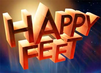
Very Happy Feet

Just went to see "Happy Feet" yesterday.
I must confess I was blown away by this movie!

True: I had very little expectations about the whole thing... The idea of realistic penguins dancing and singing all over a film that is not a musical seemed pretty awkward.
Penguins tap-dancing and singing tunes from the 80s and 90s... strange.

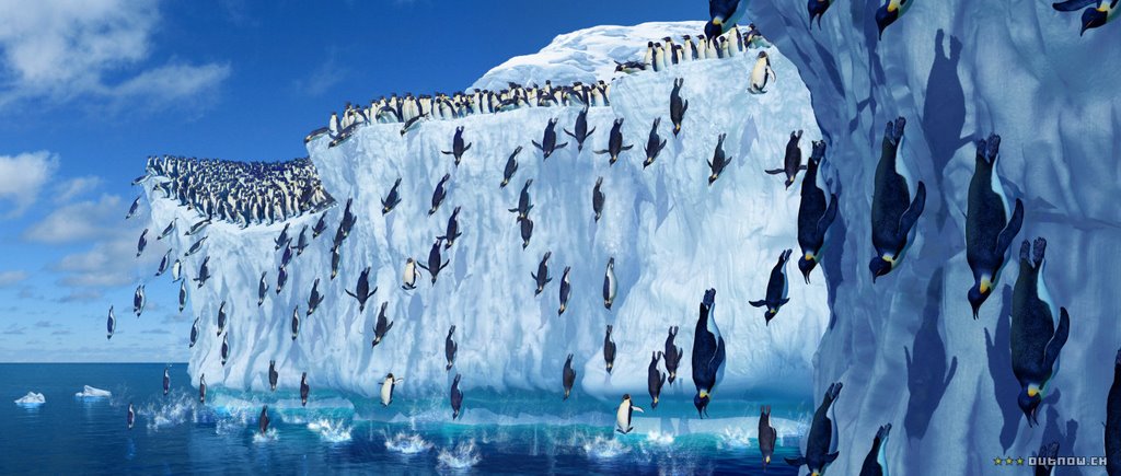
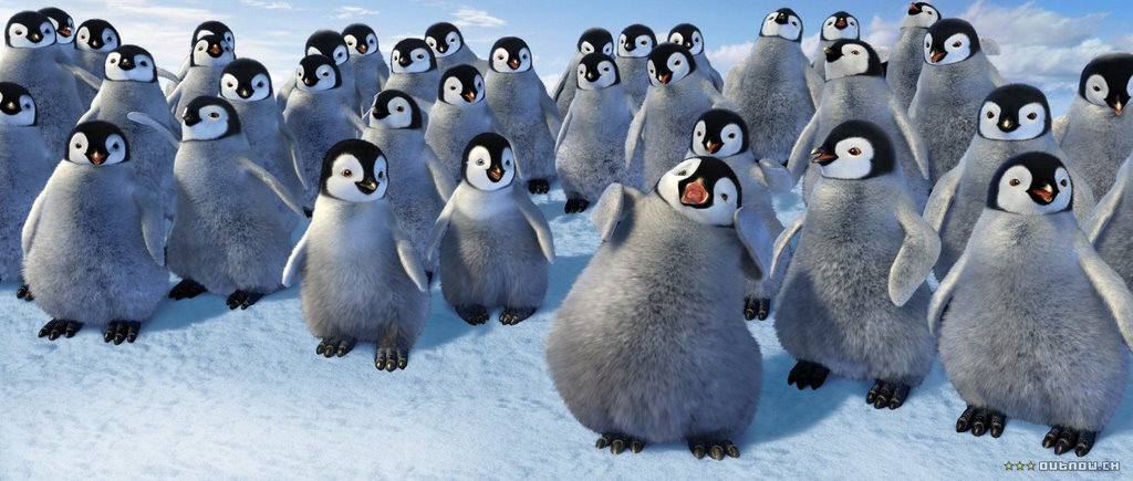
However the film surprised me. The animations (and motion capture) were very well done - it's hard to get some emotion from penguins, but they did a great job there.
But what really got me "wow" was the rendering: texture and lighting... The environments are amazingly real. The details in each shot are so many!...

I recommend to everyone. It's a must see!


Wednesday, October 04, 2006

DuPont showcased

Motionographer.com is one of the best sources of information about the subject of motion design on the internet today.
Countless articles, interviews and in-depth, behind-the-scenes articles on the top motion design projects and houses on the planet.

They are currently showcasing an interview and "behind-the-scenes" article on the making of the DuPont ad produced by Lobo earlier this year.
I'm glad to have had the opportunity to join the production early on, and work along with both Lobo and Vetor Zero teams on this challenging, abstract project.

The whole spot can be viewed from my website through this link. And the whole article can be found here.

The article is quite thorough and features some examples of early visual development and production tests.
This project was quite a challenge because of the extremelly abstract concepts and sheer ammount of elements that represented DuPont's reach over many areas of research and production. These elements had to be portrayed in a flowing visual "dance" that was brilliantly developed by our design team at Lobo, collaborating with our 3D and R&D departments at Vetor Zero.

A great example that team-work cannot be beaten!

Saturday, September 30, 2006

Surf "vibe"!

I'm not a surfer - though a part of me would most definitely LOVE doing it! I just don't think I was "cut" for it somehow...

Anyway, Sony Animation is releasing it's new animated feature next year. Ok, there's still some time to go, but the first trailer is online, and boy, does it look awesome!! My good friend Renato dos Anjos is animating the lead character, and doing a great job as usual... :)
The characters show excellent design, and the story promisses to tap into what I think is really cool about surfing.

You can relate to the characters' thrill for riding the waves, and the whole thing about the story seems to talk about doing that not through the movie-selling "radical sports" trend, but it looks like it's more about the true "vibe" of surfing - of enjoying the feeling of being alive and being in sync with the water, the sky, the whole energy of creation that surrounds you as you ride the waves...

If that's what Sony aims to build this movie on, I wanna be first in line!
I'm tired of the same crappy ideas some studios insist investing on. So I'm hoping there's a new trend in animation comming up... Less farting ogres and more characters with true personality and spirit. I end up enjoying those movies that make me leave the theater thinking about my life, and characters I can relate to in a positive way.

I'm not talking about "shinny, happy cartoons"... I'm talking about a Woody that feels jealous and rejected, about a Buzz that is egocentric and detached, a Sully that questions the purpose of his existence, a Lightning McQueen that hits rock-bottom to find out what life is really about, a Mater who is happy about who he is no mater what, a Chicken Little who craves for acceptance, and so on.

All of these are funny and entertaining. But they also have "spirit", content, "stuff"!
I hope Sony has found a way of doing that in Surf's Up. Otherwise, this will be a waste of the whole "surf vibe"...

Meanwhile, I'll go on experiencing the "vibe" vicariously through some surfing friends of mine!

Cheers!

Thursday, September 21, 2006

New Vetor Zero website


Vetor Zero is the company I've been working with for the past 7 years.
A lot has happened ever since, and some of this can bee seen by browsing our brand new website.

Go check out www.vetorzero.com!!


Monday, September 18, 2006

Chipicao redesign!

Chipicao is a popular brand from Chipita - a subsidiary of Vivartia S.A. - that produces various pastry products sold throughout Europe and a few Eastern countries like Egypt, Lebanon and Kazakhstan.
Chipicao is a chocolate-filled croissant targeted to kids, and "Chipi" is the brand's mascot.

We were approached by a Portuguese ad agency that was participating in a bid to get the whole Chipicao account for all Europe. They wanted a full redesign of the character to aim towards a more pre-adolescent audience.
This is our first version of that, and it helped the agency to nail the account right away!

The 3D model, and character rig were done by my good friend Alex Liki. I handled art direction, shading and lighting.
I'll post a new version soon that has the final features of the character, plus a few other angles.
Stay tuned!

Tuesday, September 05, 2006

Let's start meeting the Robinsons!...

Yes, it will be out pretty soon.
Disney's "Meet the Robinsons" is already raising some eyebrows with it's colorful - not to say "daring" - art direction.
Things show amazing color palettes and sets and props from the future seem to have come from the Imagineers' wildest concepts for Disney World's "Tomorrowland".

What I've seen so far has gotten me curious about this one... the story seems to be pretty original, and the characters show the same wildly exaggerated style shown in "Chicken Little", now applied to humans and with an extra "punch".


Jim Hill Media is showcasing a few images from the upcoming "Art of Meet the Robinsons" book.
They are definitely worth peeking, and I'd say the book is a definite "must buy".
Let's hope the movie will keep the standards high for Disney.
The previews I saw during Siggraph 2006 gave me the impression I won't be disappointed... ;)

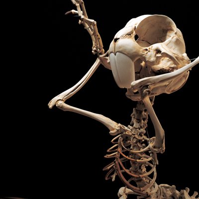
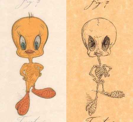
SKELETOONS!!

Ok, so moving a little bit back to our central theme for this blog, I urge you to take a look at the images of Corean artist Hyungkoo Lee.
His work is being displayed at the Arario Gallery in Korea.


Taking a hint from the works of artist Michael Paulus, he took things a step further by actually building quite believable and "anatomically-correct" resin casts of the skeletons of some very famous animals from the Cartoon Kingdom.


Do check out both websites for some great imagery and creativity!

Friday, August 11, 2006

Can you imagine the Tenth Dimension?!...

Ok, this isn't really CG-related but appeals greatly to the "geek" inside every one of us... heheh

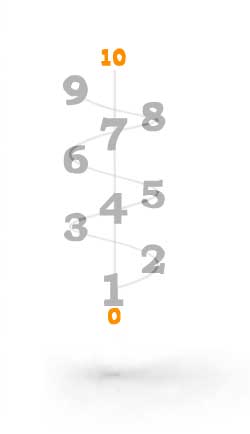
A new book is out called "Imagining the Tenth Dimension" by Rob Bryanton. To publicize the book, he put together a nice website with a series of Flash animations describing very plainly the concepts behind each dimension from 1 to 10
that helps to visualize them. Essentially it is like the difference between 2-dimensional "flatlanders", and our well-known 3 dimensions, which is something we fairly easily can visualize.


At Tenth Dimension, you find a quick tour of the possible 10 dimensions of a universe based on string theory.


Well, I don't know how scientific it is. Scientists who talk about 10 dimensions tend to bend over backwards to point out that they're not really the kind of dimensions that are useful for us to move in, but they're just sort of curled up in a very small place, of no practical significance to us, and only needed to make the equations add up. Which I tend to not believe, so I like it better this way.

So, we can imagine the same magic continuing in more dimensions. Seen from a lower dimension, somebody who moves in a higher dimension can do impossible things, like appear out of nowhere, or travel huge distances in an instant. Because higher dimensions fold lower dimensions. Just like you might find certain distances on a piece of paper (a 2D plane), but you can fold it in 3 dimensions, and bring any two of its points together, so you can get from one to the other, without traveling any 2D distance. It would be equally logical that you can do the same with time and 3D space, or with whole timelines, or universes of possibilities, once you use more dimensions.

And if we assumed that the real reality is the 10 dimensions, rather than the 3, 3 1/2 we're used to, it potentially can change our perspective greatly.
The dimensional concepts presented can have a strong metaphysical tone, allowing you to extrapolate to life and death, the afterlife, and God...

Truly an excercise of logic, ingenuity and imagination! Will give your brain stuff to chew on for a while! Hehehe

Sunday, August 06, 2006

The CG Treasure Chest


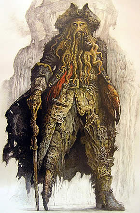
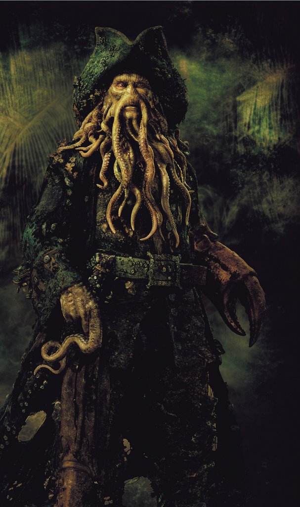
What is that Davy Jones?!!
After seeing "Pirates of the Caribbean: The Dead Man's Chest" for the second time, I still left the theater amazed...


ILM was showing off it's technical prowess during Siggraph 2006 at several events: Autodesk's AGUA, Pixar's RenderMan User Group Meeting, a few Siggraph technical sketches and at Lucasfilm's booth on the exhibition floor.

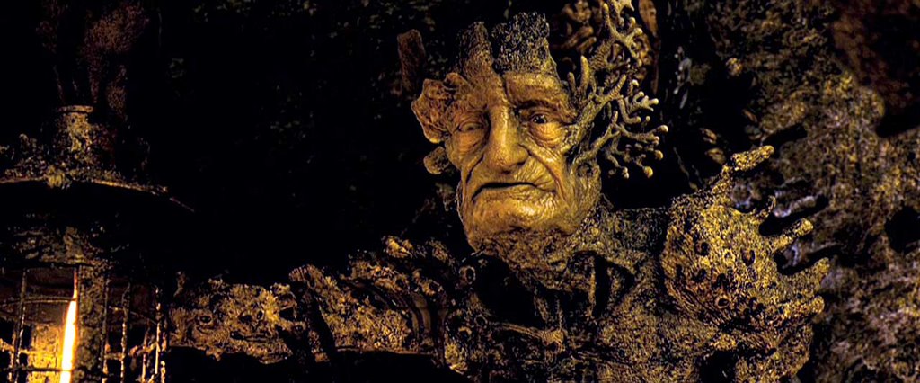
Though there's a huge amount of effects (digital and non-digital) throughout the movie, nothing strikes your eyes more than the über-villain Davy Jones. Most of ILM's presentations were focused of the hardships of making Jones come to life.

Davy Jones was played by the talented Bill Nighy. The captain of the "Flying Dutchman" is a half-man/half-sea monster being who haunts the oceans since the day he had his heart broken by an unsettled love affair.

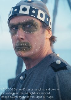
Nighy was shot with a grey marker suit to give the CG team accurate light positioning and color temperature from the set. Though some make-up was added to his eyes and mouth for a "backup", Davy Jones is ENTIRELY CG throughout the movie.

ILM captured the actor's movements from his shot performance and
relied heavily on keyframe animation to exaggerate his acting and animate his face and tentacles.


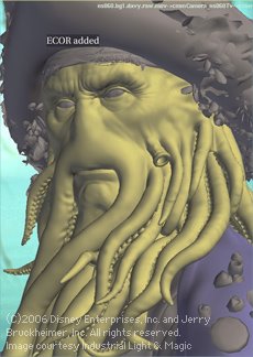
For those, ILM technicians created a dynamic setup that could simulate the physics of each tentacle with gravity, collisions and basic curvature; on top of the simulations the animators could select which parts of each tentacle would receive hand-animated keyframes, and which parts would remain simulated. On top of that, there was a system that allowed the animators to paint areas of the tentacles that would be "sticky", and how much "stickyness" they could have, so the tentacles would adhere to each other and to Jones' clothes, and detach depending on their speed and/or based on the animator's cue.


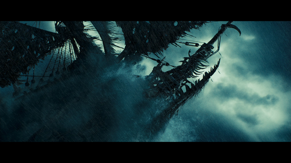
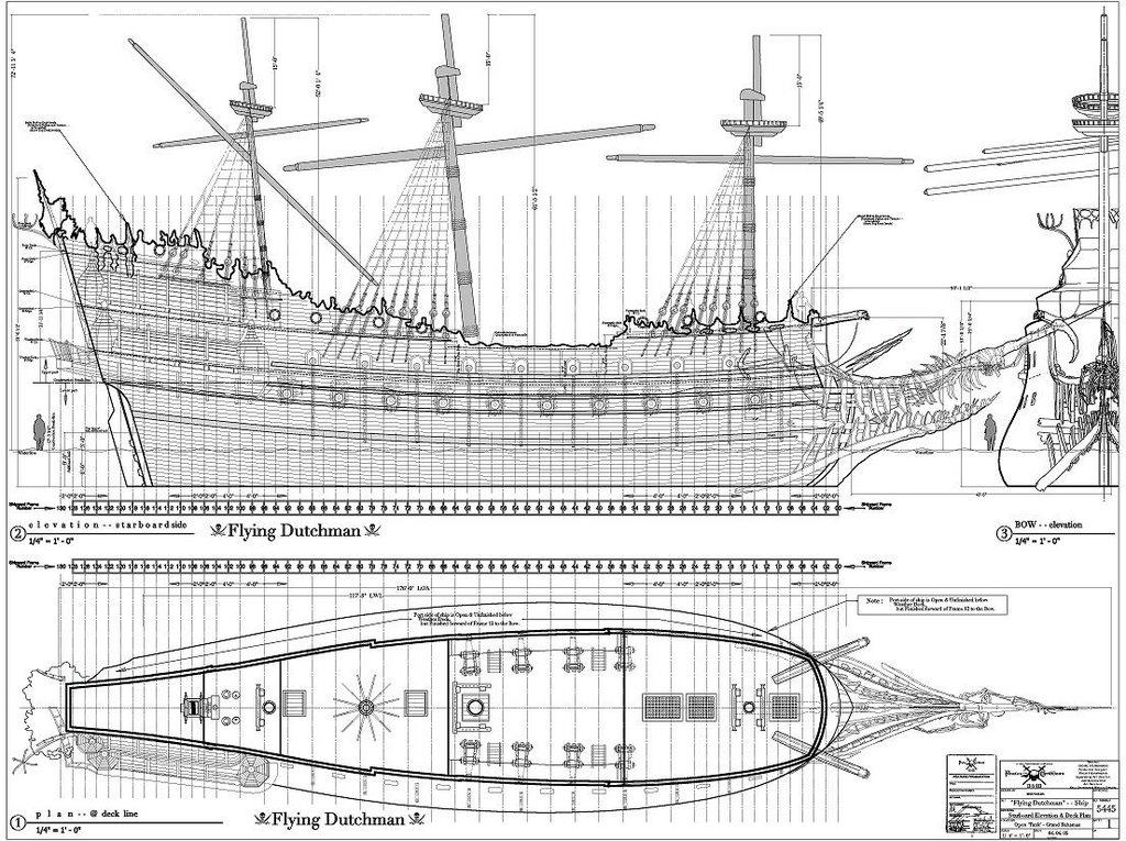
Jones is the captain of the "Flying Dutchman", a frightful sight that seems to be as much a part of the ocean depths as its cursed captain.


The ship was built to full scale as a set.
A digital
replica was provided by ILM for several shots, which was extremelly accurate and provided its own rendering challenges.


The ship's crew was also created as CG characters. While some background crewmembers were shot with make-up, most of them - specially the main crewmembers - are entirely computer-generated throughout the movie using the same techniques as Davy Jones.

ILM used RenderMan to render all the CG elements in the movie.

One new RenderMan version 13 feature that was crucial for the production was its new ambient occlusion workflow that doesn't require expensive raytracing calculations.
During Pixar's RenderMan User Group Meeting, an ILM technical director was praising this new feature saying they would not have been able to render some of the most complex elements (such as the digital "Flying Dutchman") using current occlusion and global illumination techniques. ILM worked closely with Pixar on this issue, and RenderMan's "traceless" occlusion and color-bleeding features were polished for this current release (PRMan 13) as they were being used for the production of "The Dead Man's Chest".

Compositing for all the shots was split between Apple's Shake, Autodesk's Inferno and ILM's own Comptime and Sabre systems. ILM used its EXR format extensively throughout the production to maintain image depth and provide extended control to compositors through extra information added via RenderMan AOV render passes.
While the public waits for the next Pirates of the Caribbean (due 2007), Davy Jones and his crew set the new standards for believability and push the boundaries of CG art and technology for the next years.


Images are a courtesy of ILM and are ©Copyright Disney Enterprises Inc. and Jerry Bruckheimer Inc.

ZBrush 2.5 is comming...

Well, true. I have shown here some images of what I have been doing while testing Mudbox.
It is an amazing app even while still in beta.

However, I have not forsaken ZBrush. It is an incredibly powerful tool, and definitely THE standard that Mudbox aims to surpass.
While that still remains to be seen, Pixologic has impressed the community again by showing (at last) the upcoming ZBrush 2.5 during this last Siggraph.

I saw the demos at their booth, and my jaw remained dropped all along! Heheh
At times they were manipulating models with over 40 million polygons without flinching - painting and displacing the darn things like there was no tomorrow! HAHAH
Simply amazing!

Here are some links to quicktime videos showing some of the main new features.
ZBrush 2.5 should be shipping sometime around October/November 2006. It will be available for both Mac and Windows (32 and 64 bits). A Linux version is underway but has no release date confirmed anytime soon...

Sub Tools
Mesh Extraction
Enhanced 3D Sculpting
Mesh Painting
3D Layers